Showing posts with label Color Photography. Show all posts

Wednesday, June 6, 2012

Blue Angels at 2012 Andrews Air Force Base Air Show (part 2)


In a recent post (Blue Angels at 2012 Andrews Air Force Base Air Show) I shared a number of photos featuring the Blue Angels - all black and white.  Today I am sharing an additional collection of photos of the Blue Angles, but all color.

There is a completely different feel to the two collections.  I decided to present the black and white in one collection and the color in a second because they evoke a different response and work much better when viewed separately.  I encourage you to look at the two collections and compare.


Have fun, and go make some great photography.

Craig

Thursday, February 9, 2012

Dragon Handlers at 2012 Washington DC Chinese New Year Parade

2012 Chinese New Year Parade Washington DC-5

The Chinese New Year parade was recently held in Washington DC.  I arrived a bit early and found one of the Dragon teams practicing for the parade.  I should have known, but never consciously realized that the dance of the dragon is choreographed and requires dedication and practice.

2012 Chinese New Year Parade Washington DC-1

2012 Chinese New Year Parade Washington DC-4

2012 Chinese New Year Parade Washington DC-2

2012 Chinese New Year Parade Washington DC

2012 Chinese New Year Parade Washington DC-8

2012 Chinese New Year Parade Washington DC-7

Come back soon to see more from the parade.

Have fun, and go make some great photography.

Craig

Thursday, August 18, 2011

Zoom Rack Photography of New York Taxicabs

NY Cab zoom rack-5

This is my third and final installment of Zoom Rack photography from New York.  Here are the links to the previous two, in case you missed them:

NY Cab zoom rack

For this final post in the series, I decided to focus on the iconic New York taxicab.  Nostalgia draws me back to the days of the Checker cabs in NY, a true icon, but at least they remain the same color.

NY Cab zoom rack-1

As you can see from the previous photo, use of the zoom rack technique can result in some interesting abstract results.  In this case, there is just enough information to give context (the Times Square Marques in the background) and the yellow of the cab to let you know this just might be a New York taxi.

NY Cab zoom rack-3

Unlike more normal bias toward black and white photography, these photographs were processed in color.  With the subject of NY taxis, it would be difficult to respect the bright yellow paint if processed in black and white.

NY Cab zoom rack-4

In addition to the yellow of the cabs, the motion introduced by racking the zoom, makes for some interesting bright light trails that are more interesting in color than black and white.

NY Cab zoom rack-2

Have fun and go make some great photography.

Craig

Thursday, May 19, 2011

Fisherman’s Wharf, San Francisco, at Sunrise

Boats at Fishermans Wharf San Francisco-12

Like many of the other San Francisco Photos I have posted in this series, the photographs for today were taken at sunrise.  The light was perfect and therefore the colors were just amazing.  Those of you who have been reading my blog for sometime are well aware of my bias toward black and white.  However the brilliant colors in these shots were too compelling to ignore.

Boats at Fishermans Wharf San Francisco-11

All of the photographs here are three shot HDR images.  In part, this explains the vivid color.  But trust me when I tell you that the native settings in Photomatix Pro (HDR processing software), the colors were so intense they were not only hyper-real, but overwhelming.  When processing these photographs, I backed off the saturation in Photomatix Pro, and then again in Lightroom.

Boats at Fishermans Wharf San Francisco-13

Hopefully, I am convincing you that shooting at dawn (or dusk) is a creative gift.

Have fun and go make some great photography.

Craig

Friday, May 13, 2011

San Francisco Fishing Fleet at Sunrise

Boats at Fishermans Wharf San Francisco

The hour or so surrounding sunrise is my favorite time to shoot.  The light is magical, and sometimes the world makes a truly painterly impression.  These photographs of the San Francisco fishing fleet are a great example.

Boats at Fishermans Wharf San Francisco-1

These shots were taken just after sunrise.  With the sun low on the horizon, the light is softer, and the colors otherworldly.  The pastel hues of these photograph mimic the cotton candy vendor at the county fair.  Although these are both HDR shots, I did not intentionally alter the colors and what you see is pretty close to what I remember.

The next time you get a chance, get a cup of coffee, take a stroll at sunrise, and be ready for pleasant surprises.

Have fun and go make some great photography.

Craig

Wednesday, April 6, 2011

DC Cherry Blossoms with Lensbaby Macro

Cherry Blossoms - Lensbaby Macro Color-7

Pretty soon I will be shooting the hangover, or aftermath of the cherry blossoms.  For the moment however, I still have some great fresh shots to share.  The photos featured here today add another layer of creativity to the Lensbaby by the application of a macro lens.  It is more like a macro adapter with a screw on lens that approximates macro, but regardless of the “how” shooting with it is a great deal of fun.

Cherry Blossoms - Lensbaby Macro Color

The difficulty in getting these shots comes from the constant winds that have stopped only briefly since the cherry blossom began to bloom.  The bottom line is that it took patience to get these shots.  It also took a lot of exposures – I have many wasted shots thanks to the wind.

Cherry Blossoms - Lensbaby Macro Color-1

In the next days I will post another set of macro photography processed in black and white.  I would post them here, but I think these work best as a set of color, and a set of black and white viewed separately.

Cherry Blossoms - Lensbaby Macro Color-2

One of the things I had not noticed before but occurred to me while shooting the cherry blossoms this year, is that all cherry blossoms are not created equal.  Specifically, some of the trees produce brilliant white blossoms with hints of pink or purple.  Others produce soft to bright pink blossoms.  I’m sure there is an explanation, but I don’t have it.

Cherry Blossoms - Lensbaby Macro Color-3

Cherry Blossoms - Lensbaby Macro Color-6

Have fun and go make some great photography.

Craig

Wednesday, January 19, 2011

California Wine Country in the Fog

Vineyard Shack

I was lucky enough to spend last weekend in California wine country (Napa Valley and Sonoma Valley) with my wife…and my camera.  Notice I said “wife” first, and “camera” second.  We had a wonderful time visiting some boutique wineries (those that either do not distribute, or have a very limited distribution and low case production) and were fortunate enough to be blessed by fog.

Flowers and Windmill

From a photographic point of view, fog is very exciting.  Follow this link to see some of the previous entries I posted featuring fog.  Generally, fog is another great excuse to process photos in black and white; a clear preference of mine.  However, I wanted to share these photos because they run counter to my black and white predisposition.  In each of the photos, my opinion was that the color added an important dimension to the final product.

Moss Covered Trees

I am a bit short on time at the moment, so my commentary will be similarly limited.  Check back in a couple of days to see another set of California wine country photography in black and white.

Vineyard Road


Winery in the Fog

Have fun and go make some great photography.

Craig

Tuesday, November 16, 2010

Fall Colors in Black and White–Golf Landscape Photography

Blue 1-1

Last week I spent a couple mornings shooting the golf course at Army Navy Country Club in Arlington Virginia and posted a few photographs to the blog (Golf Landscape Photography at Army Navy Country Club).  As the regulars to the blog know well, I am biased toward black and white photography but the striking fall colors were quite compelling and led me to process (most of) the shots in color.
Blue 4-3

Even though I relented to the color, I could not completely give in.  The photographs in this post are a few that I decided to process in black and white.  For the most part, these shots were either similar to other photographs I had processed in color, or the color was not sufficiently dramatic to convince me that retaining the color information was the best choice.

Blue 4-5

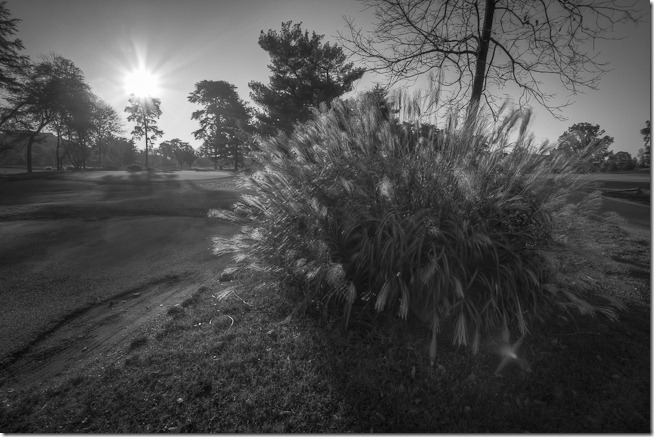
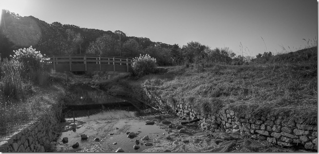
One of the difficult aspects of shooting a golf course in black and white is providing context and scale.  Our mental image of a golf course includes lots of green (fairways, greens, rough, and trees) with a smattering of white bunkers.  When processing in black and white, the color context of a golf course disappears and challenges our mental image.  In other words, the greens, fairways and rough loose some of their definition and the result is something that looks much less like a golf course.
Bridge at Red 6

In order to make these black and white photographs “work” I selected compositions with strong foreground elements, texture and strong lighting to provide a sense of scale and context.  Without these components, I feel the “golf course” is lost.

Red 3-6

As an example, look at the next photograph.  While having the bunker as a foreground element, and the cart path leading the eye through the composition, this shot (in my opinion) is much weaker than the previous photographs which have stronger foreground elements, texture and light enhancing scale and context.

Red 4-3

Even though the fall colors were clearly the star element of this project, my bias for black and white photography leaves me satisfied with the B/W results as well.  As we transition from fall to winter, I am excited to extend this project to the more austere views brought on by the skeletons of barren trees.  And although I would prefer to golf, some photographs with snow will make for some interesting and challenging black and white shots.

To see the whole shoot, visit my ANCC Set on Flickr.

Have fun, and go make some great photography.

Craig

Friday, November 12, 2010

New York Street Photography

Graffiti Alley

Three posts in a row featuring color photography!  I noticed the last two each featured color, so I said why not?…make it a third.  This post is also inspired by the quickly approaching Thanksgiving Day celebration which I will be passing in New York with my family.  My daughter is preparing her first big family Thanksgiving feast, and I am very much looking forward to it.

Heating Depot

The photographs featured in this post were taken in March, 2010 on a trip to NY to visit my daughter.  New York is a paradise for street photography.  Not a step goes by that something new and interesting is sure to cross your path.  The first two photographs are a great example.  These shots are of the same alley.  The second, at the entrance to the alley, and the first further into the alley.  Except for the blue doors and window frame of the café at the end of the alley, it would be difficult to recognize these shots were taken within 100 feet of each other and focused in the same direction.

Brooklyn Bridge Condos

The previous photograph is a small portion of the Brooklyn bridge.  It is unclear what is going on inside these doors, but my mind was wandering a bit when I named the shot “Brooklyn Bridge Condos.”

Old Staten Island Ferry

This photograph of some details from the Old Staten Island Ferry Building begged to be processed as color.  I really wanted to make the B/W transformation, but the colors kept screaming to be free.  With some great tonal range within the colors, I relented.

School Church Park

Finally, here is a shot of a school and a church from a park.  Sorry, I don’t recall the name of any of them.  But I can tell you what I like about the shot.  First, the starkness of the barren trees add a wonderful texture to the composition both directly and through the shadows cast on the ground.  Second, the lightly clouded blue sky  frames the buildings and park below while adding a complimentary color.  Finally, I like the colors of both the church and the school particularly in the way the two color relate to each other.

I’m sure I will be returning to black and white soon, so stand by.

Have fun, and go make some great photography.

Craig

Saturday, July 3, 2010

U.S. Coast Guard Silent Drill Team (color)

Coast Guard Silent Drill Team-3

This post wraps up my coverage of the retirement ceremony for Capt David Newton.  This post features some color photography of the U.S. Coast Guard Silent Drill team (opposed to the black and white presented in my last post).

Coast Guard Silent Drill Team-4

As you are likely aware, I am biased toward black and white photography and have written frequently about my thoughts on this subject (if you enter “why black and white” in the search box at the top of the page, you will be rewarded with a number of prior posts describing my thoughts on choosing black and white over color photography).  However, sometimes color works…even for me.  In the case of the photographs in this post, I’m not sure the choice of color complies with my normal rules.  For these photographs I believe it may be a matter of psychology completely unrelated to photography.  There is not much important color in these photographs.  In other words, the color does not provide a notable level of new information that would not be present in the black and white photography – the color simply does not play an important role.  My theory in explaining my choice to maintain the color is that after spending 27 years in a Coast Guard uniform, I somehow had to save at least a few color photographs in reminiscence of my time in blue.

Coast Guard Silent Drill Team-13

I hope you have enjoyed this series of photographs from Captain David Newton’s retirement.  I had a great time shooting this event and look forward to similar opportunities.

Craig