

In my post titled “Solitude” (April 28, 2009) I talked briefly about my decision criteria for processing a photo in black and white. In that post I promised to talk more about my decision process. I was also challenged by a good friend, Steve, to show some examples.
In this post I will further explore the first question I apply in making a decision to consider converting a shot to black and white. In the “Solitude” post, I said my first criteria was “does the color information in the shot add value to the final composition?”
The first pair of shots, at the beginning of this post, are from the Supreme Petroleum Council Building in Abu Dhabi. This example clearly shows a relevant decision point for the process of conversion to black and white. The original shot has some brown tones in the concrete and a bit of blue in the slight area of exposed sky.
Had I decided to further crop this shot to eliminate the sky, there would be even less support for keeping this in color. As a tangential point, there is good reason I did not further crop the shot. I love this shot because it has a number of lines leading your eye through the shot. You likely found yourself viewing this shot from left to right with the lines of the floors guiding you along to the right. Then your eye would likely have started to explore what was going on vertically…and then being drawn once again from left to right. Had I cropped out the sky and the stacking part of the building in the upper left of center, I would have lost some of the visual interest.
The second pair of shots is similar in that the prairie dog (from the Al Ain Zoo in the UAE) is nearly the same color as the ground it is standing on. With respect to color, this shot is essentially a two tone photograph; the color adds very little information to the composition.


The next shot is unique because it was taken with a lens that brings one area of the shot into clear focus while increasingly blurring the rest of the shot as you move away from the center of focus. Again note the amount of color information in the original, and the change that occurs in the transition to black and white.


The life ring and cleat shot was taken with a Lens Baby 3G. If you have not seen this lens before, it looks like some sort of medieval torture device. The unique appearance is complimented by even more unique results. In a future post, I will feature shots taken exclusively with the lens baby. If you are interested in this lens, or even better, the next generation Lens Baby Composer, check them out at www.lensbaby.com. This is a terrifically fun lens and adds a whole new level of creativity to your photography.
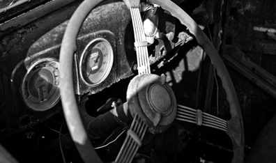
The next shot is the cockpit of a decaying 1940-something Ford that sat alongside the road in Southern Maryland. Except for the yellow hue in the dash gauges and the reddish tones in the wheel, there is very little color information – the choice to go black and white was easy and much more consistent with the era of the car.

The following shot comes from the lobby of the Solar Lab at the National Renewable Energy Laboratories (NREL) in Boulder Colorado. This shot is nearly black and white without any adjustment. The only hint of color comes from the window below the dome letting in natural light to the lobby. This is a fun shot because it is a unique piece of architecture and also because of the full tonal range, gradual transitions and the only occasional sharp edge.


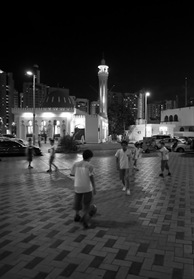
Arguably, the next shot has sufficient color to make you wonder why I include it in the group of photographs considered to have too little color information to warrant a color shot. To a certain extent, this is true. However, the color is highly concentrated in a couple of areas including the top of the minaret, the grass around the mosque, and the green of the mosque dome.
By removing those few points of concentrated color, I think the shot becomes much more interesting.

The Washington Monument in Washington, DC during a snow storm leaves very little remaining color. In this case, there is a slight yellow hue to the monument and because the shot was taken at some distance, the flags at the base show just specs of red and blue. I find the black and white version much more interesting and consistent with the starkness of a menacing sky, barren trees, and snow covered ground.


The next shot takes us back out to Colorado and the National Renewable Energy Laboratories. This shot features a wind turbine blade in the foreground, quickly followed by the mountain range, then domination by a dramatic sky. The tiny bit of color comes primarily from the brown grass. I find the drama of the sky much more compelling in black and white. The bit of color in the dormant grass is not missed.


The next shot, “Storm over Lincoln,” combines the key elements of the Washington Monument in Snow with the NREL wind turbine shot. The color is limited to the slight hue in the monument’s stone, and the dark green, nearly underexposed trees bordering the reflecting pool. The entire scene is complimented by a dramatic and foreboding sky. The sloping tree lines draw the observers eye to the Lincoln Monument, then up to the sky.


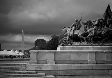
The next shot is of the Ulysses S. Grant Memorial in front of the U.S. Capitol building. The shot is interesting on a number of levels. First, the stormy sky sets the scene for battle – a gloomy and threatening day as General Grant leads his troops, in this case, against the invaders of the national mall who have setup large tents and barbeque pits!
The only color of significance in the shot is the oxidation on the monument proper. With the conversion to black and white, the green oxidized metal gains additional contrast and makes the shot more consistent over the tonal range of the composition.

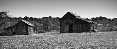
The next shot is an interesting case. The pair of Southern Maryland barns has sufficient color information with respect to the blue in the sky, the green grass, and the red of the barns themselves. However, much of the barn is in the shade, and the color is very muted. In this case, the color information was not sufficient in the area I wanted it. The black and white version brings out much of the detail in the shadows and adds more interest to the shot.

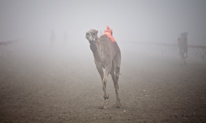
For the final example, we return the camel races in Al Wathba UAE, just outside of Abu Dhabi. Consistent with the theme of this post, there is very little color information in this shot. The photograph is dominated by the fog with the subject just emerging and several other camels appearing as apparitions in the distance. The only color information is the slight brown hue of the subject camel, and the dominant orange of the mechanical jockey. In answering the question of sufficient color information, clearly this shot deserves to be black and white according to the criteria I use. Additionally, I find the bright orange of the mechanical jockey to be distracting – the jockey is not the subject of the shot.

I hope you enjoyed this post and I hope I satisfied Steve’s request for some examples. If you have any requests about any subject relating to photography, please send me a note at craigcorl@yahoo.com. I am happy to respond. I have plenty of subjects to write about, but would be particularly pleased to know I am helping someone understand something new about my passion.
Enjoy, and do something nice for someone today.
Craig
Thanks Craig for a truly enlightening post. I continue to learn so much through your pictures and your detailed comments. I look forward to each of your posts. Take care "My Friend".
ReplyDelete