Showing posts with label Composition. Show all posts

Friday, September 2, 2011

Union Station and Washington DC Metro: Repetition as Leading Lines

Union Station Metro

I have written separately about using leading lines in photographic composition and repetition as a composition tool.  In this post, we have examples of the two composition techniques in combination.  In other words, examples of repetition forming leading lines that draw the viewers eye through the photograph.  In the first example, a photograph of the Union Station Metro, there are leading lines in abundance – the ceiling pattern, escalator, train tracks, and the ceiling seams.

We are naturally drawn to consciously or subconsciously discern patterns – it gives us another level of information about our environment.  When repetition and leading lines are combined in photography, the result can be very compelling.

Farragut North

In the second example, taken at the Farragut North Metro Station, we have some of the same elements along with the dimples, lights, and tiles in the floor.

Union Station Arches

Moving outside of Union Station, the repetition of arches and lamps again form leading lines that guide your eye through the photograph.

Capital Bike Share

Finally, moving a bit further outside of Union Station, the line of bikes at the Capital Bikeshare rack are yet another example of repetition forming a leading line.

Have fun, and go make some great photography.

Craig

Monday, August 8, 2011

Zoom Rack Photography in New York

Street Action

Earlier this year, my good friend and fellow photographer John Downey (John A Downey II Photography) introduced me to a photographic technique I decided to play with during a trip to New York over the weekend.  I don’t know that the technique has a name, so I gave it one – zoom rack photography.  The technique is conceptually pretty simple, but it takes practice to get it right.

Times Square

The technique involves composing a photograph using a zoom lens at a short focal length then simultaneously “racking” the zoom to a longer focal length while depressing the shutter button.  Easy stuff, right?  But wait, there is more.  The real challenge of executing this shot is a sufficiently long shutter speed that allows you to rack the zoom from a short to long focal length.  My experience with this in NY led me to conclude that the optimum shutter speed was 1/4 of a second.  To get a decent exposure at this shutter speed generally means lowering your ISO and increasing your f-stop (high number/small aperture).  If you are shooting in bright sunlight, even your lowest ISO and highest f-stop may not get you to 1/4 second shutter speed.  In bright light, you may have to add a neutral density filter.

Bikes and Cones

The next challenge is stabilizing the camera.  The amount of stabilization will depend on the level of clarity you are trying to achieve.  This type of photography intentionally blurs most of the photograph.  However, you can increase the clarity by good technique (bracing your arms), steadying the camera against a solid object (like a lamp post) or using a tripod.  All the photographs in this post were hand held or braced against something solid.

One of your first impressions of this form of photography may be that it looks somewhat like photography made with a Lensbaby.  I would not disagree but would point out two aspects that distinguish this approach.  First, because of the longer exposure time, objects in motion are further accentuated with motion – like the cyclist in the previous shot.  Second, you get some unique effects I can’t as easily account for such as in the following photograph.  I don’t think I could recreate this photograph using a Lensbaby.  The smoky, ghostly steaks coming off the buildings while keeping most of the shot in relatively good focus is not something the Lensbaby is built for.

Ghost Buildings

Like any photographic technique, this is certainly one that can be overdone.  However, used judiciously and in compositions amenable to the technique, you can add another fun tool to your kit.  Later this week, I will post more shots from NY using this technique – just to be sure I have overdone it.

Have fun, and go make some great photography.

Craig

Thursday, August 4, 2011

Two Concept Photographs for the “Messenger”–The J.O.B.

Rush Hour Ghosts-1

After a good night’s sleep aided by my last culinary adventure (see Craig’s Grape Adventure tomorrow when I post Trinidad Doubles with Cucumber Chutney and Trinidad Pepper Sauce Paired with 2010 Cupcake Sauvignon Blanc), I set out before sunrise to work on some photography for the new single “Messenger” to be recorded by The J.O.B. (The Jim O’Ferrell Band).

The photos featured here represent several of the concepts I have discussed with Jason Crawford (electric guitar extraordinaire) including the ghostly images of the subjects evoking an unconscious connection among them.  The purpose of this post is to discuss how I captured the images.

Rush Hour Ghosts

The first component is that of capturing the subjects in motion – leaving them with a ghostly blur.  This requires a long enough shutter speed to allow the blur to develop.  This is why I was out the door early.  I do not have neutral density filters (dark filters that limit light arriving at the sensor), so I had to rely on taking the photos under low light conditions to maintain exposure and achieve a sufficiently long exposure to capture the motion.

The second challenge was getting enough bodies in the photo to achieve the crowded bustle and energy I desired.  To do this, I composited 10 to 15 shots for each photograph.  More precisely, I set the camera on a tripod to maintain a constant composition, then took a bunch of shots as I saw people in the positions I envisioned.  In post processing I started with a base photograph, overlayed the other 15 or so shots, and then masked in the subjects to get all the bodies in the same shot.

Stay tuned for further updates on this project.

Have fun, and go make some great photography.

Craig

Friday, July 22, 2011

Graffiti–Art, Destructive, or Just an Interesting Background?

Brooklyn Graffiti-3

Graffiti is a topic for which I have mixed feelings.  On one hand, I have seen beautiful and creative artwork that is well composed and sometimes even well placed.  On the other hand, there are plenty of examples of less artful graffiti that is improperly placed.  These are the extremes, and from my experience, there is plenty of room between these two points.
Another Dance Move

So lets take this idea a little further.  The following graphic presents a simplified model for classifying graffiti based on the location appropriateness combined with the creative or artistic merits of the graffiti.

Creativity Cool, but why here? Wow!
Go Back to School Practice at home
Location Appropriate

Based on this model, the pinnacle of graffiti is a highly creative, composed, and artfully executed work placed in an appropriate place.  As with any piece of art, each of these elements are highly subjective and are bound to be viewed differently from person to person.  Much in the same way, you might judge my photography with appreciation, or you may find it lacking in any number of characteristics.

H Street Graffiti-2-2

Of course, like photography we could make this much more elaborate by judging the materials used, the technical execution, the appropriate use of color, symbolism, composition, and so on.  But honestly, when you are walking down the street, you probably judge graffiti in a more simplified manner – much like the matrix I have proposed.  I will also allow that many people find graffiti as destructive and not worthy of any meritorious assessment.  This view is one held by those who believe graffiti is nothing more than an emblem of urban blight, misguided youth, or gangs marking their territory – another symbol of urban decay.
Graffiti Alley

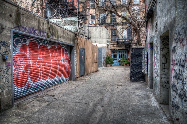
Lets change gear to graffiti and photography.  With respect to photography, graffiti can be an interesting backdrop.  You have undoubtedly seen glamor or fashion photography featuring a beautiful model in a grungy location with graffiti in the background.  This has little to do with the proposed evaluation matrix, but it speaks to the use of graffiti to set a mood or an aesthetic for the subject of the photograph.

The Human blur

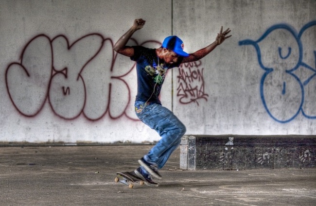
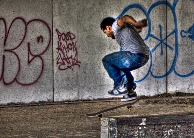
For example, the context provided for the skateboarders in the photographs in this post make these shots more interesting than what I may have found at some squeaky clean suburban skate park.  The graffiti provides a context that is complimentary vs. the contrast of a slinky model in a red dress.

Wishing He Was Older

In summary, I have now planted a seed in your mind – the next time you walk down a street and see some graffiti, I dare you to not judge it with respect to creativity and location appropriateness.  Along the way, I hope I have planted a seed with respect to your photography.  Find some interesting graffiti – become an amateur urban archeologist - and use it in your composition.  It can be a valuable and free backdrop.
Land it

Have fun, and go make some great photography.

Craig

Monday, June 13, 2011

Diptych of Chairs on the Beach

Chairs on the Beach diptych

Diptychs are one of the aspects of photography I am particularly drawn to.  If you are not familiar with diptychs, they are pairs of photographs that have some relationship to each other whether a matter of continuity, contrast, similarity or otherwise compliment each other in some interesting manner.  I have posted several diptychs previously which can be found by typing “diptych” in the handy search bar at the top of the page.

The diptych featured here is composed of two photographs I shot while walking along the Potomac River in Southern Maryland.  Although the shots were taken at different points along the beach and separated in time by several minutes, I believe the composition works due to the continuity of the subject as well as the beach, horizon and cloud configuration.  I am also drawn to the minimalist composition of this pair which leaves your mind to wander.

I did not plan this diptych, but when processing the photos, it was clear they belonged together.  Just another one of the happy coincidences that I love about photography.

Have fun, and go make some great photography.

Craig

Wednesday, June 8, 2011

Patuxent River Naval Air Station Triathlon–Bike

Pax River Triathlon-15

Welcome back to part two of my mini-series of posts featuring photography from the Patuxent River Triathlon.  Today’s post will focus on the bike leg of the race.

Pax River Triathlon-16

Similar to the case with the swim, the bikes and clothing are plenty colorful.  However, I believe these shots work much better in black and white.  For example, the first shot of the post has a couple of distracting elements when viewed in color; a) the green of the grass and background trees that bisect the photo, and b) the yellow of the center line cutting through his bike.  While these are not horrible flaws, when processed as black and white, they become complete non issues.

Pax River Triathlon-12

If you scroll back up to take a look at the second photograph, you can see a good example of a traditionally framed cycling shot.  The components to this composition include a) leaving “room” in front of the cyclist so he visually has a place to go (imagine how awkward it would look if the front wheel were on the right edge of the composition with a bunch of open space behind the bike), b) I used a sufficiently slow shutter speed to blur the wheels a bit – introducing a sense of motion, and c) further enhancing the sense of motion by panning the shot and introducing more motion blur to the immobile parts of the composition.

Pax River Triathlon-14

Pax River Triathlon-5

Brian at Pax River Triathlon-10

Pax River Triathlon-11

Have fun, and go make some great photography.

Craig

Monday, June 6, 2011

Patuxent River Naval Air Station Triathlon–the Swim

Brian at Pax River Triathlon-2

Back in the day (I think it was a Wednesday), I used to go to triathlons to compete.  This weekend I went to the Patuxent River Naval Air Station Triathlon to support Chef Sue (my wife), Gunslinger Teji, and Triathlon Buddy Brian.  Back in the day, Brian and I trained and raced together with religious fervor.  Quite impressively, Brian is still racing – and racing well.  At a shade over 50, He won his age group and was not far off the leader’s time – quite impressive.  Chef Sue and Gunslinger Teji were there with the intent of finishing; both accomplished their goal.  Congratulations.

Brian at Pax River Triathlon-4

Triathlons are target rich environments for photographers, so I took advantage of the opportunity.  I do not claim to be a sports photographer and definitely tend toward a more artistic interpretation of anything I shoot.  This triathlon is no exception.

Brian at Pax River Triathlon-6

So what distinguishes my “artistic” interpretation of a triathlon from what one would normally expect from a sports photographer?  While taking the photography, I probably would not have been able to tell you.  But in retrospect, as I look through the entire group of photos, I see several trends including:

  • lots of shallow depth of field
  • composition that fills the frame rather than larger environmental compositions
  • about half of the photographs were processed as black and white – an artistic choice
  • detail shots

Pax River Triathlon-1

With so much activity and being surrounded by interesting subjects, I shot a lot.  My hit rate (shots I felt worthy of keeping) was also pretty high.  For this reason, I will cover the race in several posts.  Obviously, this post focuses on the swim.

Pax River Triathlon-13

From a photographers standpoint, triathlons are generally started in good light.  Triathlons normally start early in the day to avoid the heat of the day.  With a 8 am start, I was lucky to have some great light (relatively low on the horizon) for shooting.  It became progressively harsher toward the end of the run, but overall, light is an advantage for early morning race starts.

Sue at Pax River Triathlon-3

Sue at Pax River Triathlon-8

The choice to process photos as black and white is not always an easy one at events such as this. One of the cool things at triathlons is the rainbow of colors. Swim suits, swim caps, bright blue water, race shirts, bikes – all full of color. Still, I find that black and white works with many of the shots.

Teji at Pax River Triathlon-5

Stand by for more posts later this week covering the bike and run portions of the race.

Have fun, and go make some great photography.

Craig

Thursday, June 2, 2011

Army Navy Country Club in Bloom–Golf Course Landscape Photography

ANCC Flowers at the Gate

These photos are dated by a month or so, but I thought to share them although the blooming trees have since taken on their summer foilage.  Over the last couple of years, I have been photographing the golf course at the Arlington campus of Army Navy Country Club with the intention of highlighting the beauty of the course during different seasons.

Blue 2

In addition to the blooming trees featured in these photographs, a key element for me is the sky.  In my opinion, one of the most important aspects of good landscape photography is an interesting sky.  A completely overcast sky with no texture is uninteresting.  Clear blue skies with no clouds are only slightly more interesting.  A sky featuring a variety of cloud formations always adds more interest.

Blue 9

And when you don’t have an interesting sky, just eliminate it from the composition.

Blue 6

Blue 4-1

Blue 4-2

Blue 9-1

White 6-4

White 6-5

Now that summer has suddenly arrived in Washington DC with temps in the mid 90s and our legendary humidity, I am forced to be a bit more selective in choosing which days to golf.  But I will not be deterred!

Have fun, and go make some great photography.

Craig

Friday, May 27, 2011

Tall Ship on the Potomac

Tall Ship on the Potomac

I arrived yesterday at our humble crab shack on the Potomac river to begin a lengthened holiday weekend.  Shortly after arriving, I looked out through the haze to the yet cool waters of the Potomac to see a tall ship sailing under power toward the Chesapeake bay.

Tall Ship on the Potomac-1

With the haze and excessive humidity, I knew a nice sharp shot would be impossible.  Even had I been able to shoot the ship crisply, the haze coupled with the complete overcast left very little texture to add drama to the photo.  Given these limitations, I decided quickly to go with minimalist approach.  With a sky that amounted to a huge soft box, I decided to use this negative space to draw attention to the subject. 

I find the photos appealing because of the simplicity, the clarity of subject identification, composition (giving room in front of the ship for movement, and including only a slice of the water/horizon), and that the photo does not provide too much information (lots of room for viewer interpretation or questioning).  However, I will admit that I may be approaching or possibly falling over the minimalist precipice.  I would love to hear your thoughts.

Have fun, and go make some great photography.

Craig

Tuesday, May 24, 2011

The Golden Gate Bridge–Black and White Part II

Golden Gate Bridge Black and White

Iconic subjects such as the Golden Gate Bridge in San Francisco, are photographed daily by hundreds, if not thousands of people each day.  That might deter an experienced photographer – why bother?  Well, it did not deter me.  So what if everyone in the world has shot the Golden Gate on everything from a iPhone to a large format camera?  While not likely unique, these views of the Golden Gate are my interpretation, and I enjoyed the process.

Golden Gate Bridge Black and White-2

On the other hand, knowing that the Golden Gate Bridge has been shot to death, I knew I did not want to take a “normal” approach.  To achieve something at least somewhat unique, I decided to mimic a 6 x 6 medium format, black and white using a DSLR.  In other words, I composed the shot with the intention of cropping to a square format, and post processing as black and white.  To further mimic the medium format, all the photographs are three shot HDR.

Golden Gate Bridge Black and White-3

The last two photographs are very similar, but I liked them both for different reasons and decided to include them both for the simple reason of indecision.  I will let you be the judge.

Have fun and go make some great photography.

Craig

Friday, May 20, 2011

San Francisco Fishing Boats–Details

Boats at Fishermans Wharf San Francisco-9

This will be my final post featuring the San Francisco waterfront and I thought to turn it into an explanation of my approach to photographing a place I am visiting.  In one sense, you could view this as part of my approach for creativity.

The recent photography of the San Francisco fishing fleet and Fisherman’s Wharf were generally wide angle or landscape type photographs.  Those featured here are more detailed photographs – filling the frame with the details of the fishing boats and gear.  This represents part of my approach to improving my creativity.

Boats at Fishermans Wharf San Francisco-5

More specifically here is part of my routine:

  1. Shoot what I’m looking at – generally wide angle
  2. Get closer and shoot details – fill the frame
  3. Get even closer and shoot smaller details
  4. Find a high angle and shoot down
  5. Find a low angle and shoot up
  6. Turn around and look at what is behind me
  7. Wait – photography is often about patience – give your eye time to see something interesting

Boats at Fishermans Wharf San Francisco-6

This may seem simplistic, but when this is part of your process of shooting, new and interesting compositions will present themselves.

Have fun, and go make some great photography.

Craig