Saturday, July 30, 2011

Lions Can’t See Zebras and Ryan Can’t See Color

Unfocus Union Station-2

The title of this post is not precisely true, but they are motivating factors for writing this post and once again advocating for one of my preferences in photography – black and white.  My son, and near clone formerly known as mini me (had to drop that when he crossed the 6’ mark), is partially color blind.  I say partially, because although he often confuses colors (name vs. what the rest of us see), there are some colors that remain prominent.  Ryan is also a budding photographer and finds his challenge with color frustrating.  This is a particular issue during post processing when it is normal to make some color correction and adjust saturation.

Ship Graveyard Trinidad

Several months ago, Ryan approached me stating he was not confident in his photography because he sees colors differently than most of us.  He feared that he might make color corrections that are unrealistic or even destructive to the photograph.  I suggested two strategies.  First, he could consider having someone critique his work and offer their opinion regarding his fears of adjusting the color or saturation in a way he did not intend.  Second, I suggested that he avoid color – process his photography in black and white – an environment that suits his comfort and competence.  While accepting this advice in the manner of a thoughtful young man, he decided to continue pursuing his question with other photographers.  I think he expects to find a pair of glasses or a magic pill to remedy his color deficiency…he likes color and wants to maintain that aspect of his photography.  I don’t take this personally, and encourage my children to question everything.

Union Station Calling

Related to Ryan’s challenge is that of the lion in pursuing lunch – the zebra.  I was just listening to a discussion about lions and zebras that started with the premise that due to the stripes on zebras, humans (other than Ryan) see zebras sticking out like sore thumbs due to the strong vertical lines and the contrast between the black and white.  However, the discussion I heard stated that lions are color blind which makes the zebra’s stripes very good camouflage and confounds the vision of the lion as the stripes blend into the black and white surroundings.  The lion’s challenge is made even more difficult when the zebras are found in a herd.  Apparently the vertical stripes meandering in various directions further confuse the lions ability to distinguish among menu items.

Tug on Marine Railway Trinidad

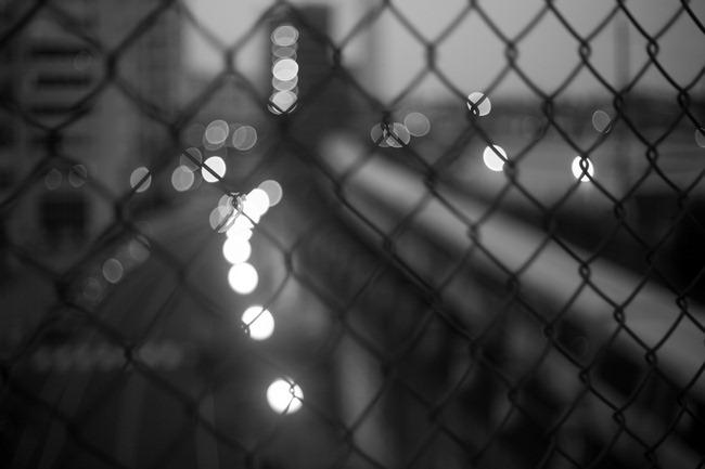
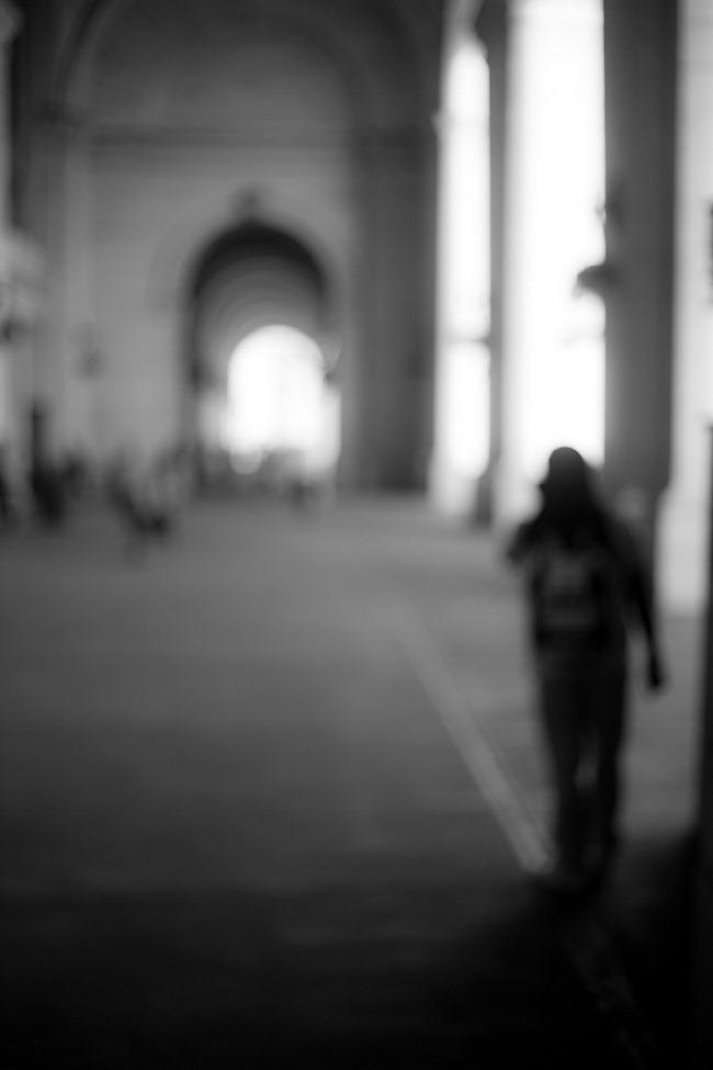
The photography featured in this post has little relevance to the subject other than it is black and white.  Two of the photographs come from the Port of Spain, Trinidad, waterfront, and the other two are part of a project I regularly pursue – Unfocus on DC.  I find great beauty and interest in black and white photography and would be quite satisfied if that were my only option.  Like Ryan, the lions are challenged in achieving their objectives. The lions are still able to have lunch through either luck, skill, using other senses, or some form of adaptation overcoming their deficiency in perceiving color. I am confident Ryan will do the same.

Unfocus Union Station-3

Have fun, and go make some great photography.

Craig
Monday, July 25, 2011

Washington Nationals Park During Construction

Players Parking Lot Quick

Although I live in Washington DC, just a over a mile from Nationals Park, I have to admit to not being a baseball fan.  It is not that I don’t have affection for the home team, but I simply don’t have the patience for baseball.  For me, baseball is somewhat like the NBA and NHL that suffer from too many games in a season for anything less than fully dedicated fans to get their heads around.  I generally reengage with these sports when playoff time comes – when every game is significant.  The idea of every game being important is what makes the NFL more appealing to me.  With fewer games in the NFL (and all college sports), each game takes on greater significance.

Right Field quick

However, my views on baseball and other sports are not the subject of this post.  The purpose is to share some photography of Nationals Park during construction.  Nationals Park opened in 2008.  These photographs are all stitched panoramas taken during the late spring of 2007.

Right Field Upper Deck Quick

I have not shared these photographs previously because they do not show well in this format.  But being the middle of baseball season, I decided to go ahead and share these with my baseball loving friends.  From a photographic perspective, there are two characteristics of these photographs of note.  First, the photographs are composed of 5 to 7 individual photographs stitched together to form a single panoramic photograph.  Second, my choice to process the photos as black and white.

Scoreboard quick

I chose black and white because it enhances the industrial feel of the composition, and because most of the color information in the photos came from construction and safety equipment.  Neither of these components added anything to the composition.

At the writing of this post, the Washington Nationals are in next to last place in the National League East with a record of 49 wins and 52 losses.  Lets hope they improve their season before the playoffs come, and I tune back in to baseball.

Have fun, and go make some great photography.

Craig

Friday, July 22, 2011

Graffiti–Art, Destructive, or Just an Interesting Background?

Brooklyn Graffiti-3

Graffiti is a topic for which I have mixed feelings.  On one hand, I have seen beautiful and creative artwork that is well composed and sometimes even well placed.  On the other hand, there are plenty of examples of less artful graffiti that is improperly placed.  These are the extremes, and from my experience, there is plenty of room between these two points.

Another Dance Move

So lets take this idea a little further.  The following graphic presents a simplified model for classifying graffiti based on the location appropriateness combined with the creative or artistic merits of the graffiti.

Creativity Cool, but why here? Wow!
Go Back to School Practice at home
Location Appropriate

Based on this model, the pinnacle of graffiti is a highly creative, composed, and artfully executed work placed in an appropriate place.  As with any piece of art, each of these elements are highly subjective and are bound to be viewed differently from person to person.  Much in the same way, you might judge my photography with appreciation, or you may find it lacking in any number of characteristics.

H Street Graffiti-2-2

Of course, like photography we could make this much more elaborate by judging the materials used, the technical execution, the appropriate use of color, symbolism, composition, and so on.  But honestly, when you are walking down the street, you probably judge graffiti in a more simplified manner – much like the matrix I have proposed.  I will also allow that many people find graffiti as destructive and not worthy of any meritorious assessment.  This view is one held by those who believe graffiti is nothing more than an emblem of urban blight, misguided youth, or gangs marking their territory – another symbol of urban decay.

Graffiti Alley

Lets change gear to graffiti and photography.  With respect to photography, graffiti can be an interesting backdrop.  You have undoubtedly seen glamor or fashion photography featuring a beautiful model in a grungy location with graffiti in the background.  This has little to do with the proposed evaluation matrix, but it speaks to the use of graffiti to set a mood or an aesthetic for the subject of the photograph.

The Human blur

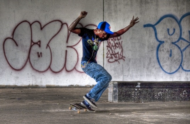
For example, the context provided for the skateboarders in the photographs in this post make these shots more interesting than what I may have found at some squeaky clean suburban skate park.  The graffiti provides a context that is complimentary vs. the contrast of a slinky model in a red dress.

Wishing He Was Older

In summary, I have now planted a seed in your mind – the next time you walk down a street and see some graffiti, I dare you to not judge it with respect to creativity and location appropriateness.  Along the way, I hope I have planted a seed with respect to your photography.  Find some interesting graffiti – become an amateur urban archeologist - and use it in your composition.  It can be a valuable and free backdrop.

Land it

Have fun, and go make some great photography.

Craig
Tuesday, July 19, 2011

Black and White Photography from Angel Falls, Venezuela

Angle Falls - 6

This morning, I was wandering through some of my photographs and realized I had shared only a couple from a trip to Angel Falls in Venezuela.  As I wandered through the Angel Falls collection , I immediately saw this as another discussion about processing photographs as black and white rather than color.

Boats on Salto Sapo - 2

In this case, my reason for choosing black and white was to maintain an aesthetic consistent with a place lost to time.  If you want to visit Angel Falls, you will need to fly to Caracas Venezuela, take another flight to Puerto Ordaz on the Orinoco River, another 4 to 6 passenger plane from Puerto Ordaz to Canaima (located at base of Salto Sapo), overnight in Canaima, then take a motorized hollowed tree (like those above) from Canaima on a 4 hour trip to Angel Falls where you will hike another mile through the jungle to reach the base of Angel Falls.  Canaima and Angel Falls are protected as part of a national park, but even without this protection, the remoteness would likely still keep this rugged part of Venezuela relatively untouched.  For me, this timeless place demanded a similarly timeless black and white rendering.

Orinoco Hut

Canaima is the last thing that looks remotely like civilization.  Once leaving Canaima, the only signs of humans are the occasional huts belonging to the Orinoco Indians, or the odd camp site on the banks of the Rio Churon, into which Angel Falls flows or the Carrao River that runs from Canaima to Angel Falls.

Angle Falls Birds

The beauty revealed on the boat trip is beyond description.  The scale is difficult to get your head around, and as you travel up the river, each bend brings another spectacular view.

Angle Falls - 3

Here is the difficulty of the scale; the photo above shows a side view of the Angel Falls plunge which measures over 1/2 mile.  It is tough to put a 1/2 mile waterfall into context.

Air Shot Leaving Canaima

The primitive beauty of this remote area of Venezuela is something you should enjoy if you have an opportunity.  The last couple of photographs were taken from our plane as we flew back to Puerto Ordaz.

Air Shot Leaving Canaima - 3

Have fun, and go make some great photography.

Craig

Thursday, July 14, 2011

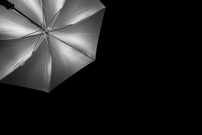
Umbrella on Black–More Motivation for Minimalist Photography

Umbrella on Black

Over the last few days I have been browsing the photography on 500px.com that have been recognized as either popular (peer rating), editors choice, and the “upcoming” photography that is gaining recognition.  I was very happy to find a number of excellent photographs using a minimalist approach to subject and composition.  I was even more pleased to find quite a few within this minimalist collection that focused on seascapes – a particular appeal to me.

The reason I mention my browsing and admiration is the value I find in studying the photography of other photographers.  In addition to the inspiration and the ideas for my own photography that can emerge, I find it a good way to judge my own photography in comparison.  With the emphasis 500px.com places on showcasing only your best photography, it is fertile ground for inspiration, ideas, and comparison. 

My only hope is that 500px.com is able to maintain these standards of excellent photography.  At present, the only mechanism employed by 500px.com to ensure these standards is an appeal to our competitive nature through the rating system which might also be viewed as playing on our egos.  However, over the long run, I am skeptical this will be sufficient.  Without some level of editorial control or oversight, it is quite possible, and even probable that 500px.com will go the way of Flickr and become a dumping ground for family photos and stupid animal tricks.  There is nothing wrong with silly cat photos – but they should be kept in their place – like Facebook.

Have fun, and go make some great photography.

Craig

Tuesday, July 12, 2011

Craig Corl Photography on 500px.com

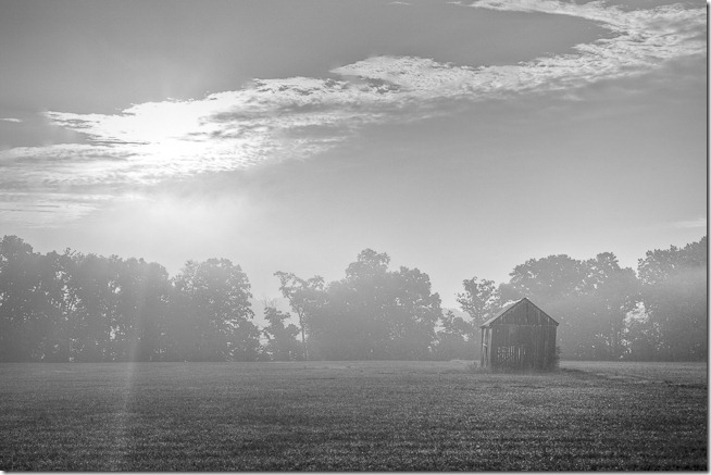
Barn the Mist

I recently heard about the photography gallery site 500px.com.  This best comparison for this site is Flickr.  Actually, it is nothing like Flickr, but with Flickr being the default photo sharing site, it is a good point of comparison.

500px.com actually predates Flickr.  Flickr skyrocketed in popularity for everyone from the mom shooting happy snaps of the kids to professional photographers.  500px.com has taken the slow road to gaining our attention, but I believe it will soon be a strong competitor to Flickr, particularly among serious photographers.

There are a number of points of departure for 500px.com and I will talk about a few that are important to me.  First, 500px.com caters to and encourages serious photographers.  The folks at 500px.com encourage photographers to upload only their best photography and discourage use of the site as a repository for everything on your hard drive.

Second, they have a highly customizable portfolio/gallery function that is very elegant and looks like a professional online gallery rather than the less than elegant hodgepodge offered by Flickr.  You can check out my gallery at http://craigcorl.500px.com/#/0.  Related to this benefit is the ability to easily view relatively large photos that highlight the quality of your work.

Finally, 500px.com employs a set of algorithms that rate your photography based on views, comments, and ratings of other photographers that is biased by age.  In other words, the rating of a particular photo decays with time.  This encourages photographers to update their portfolio with new work and thereby ensure continued refreshing.  It also promotes some healthy competition and regular feedback regarding how your photography stands up to other excellent photographers.  I encourage you to checkout 500px.com and of course, visit my gallery as it builds.

The final note for today is a change I made to this blog over the weekend.  Back in February I decided to give Google Ads a shot.  This program permits Google to place adds on your blog in exchange for revenue gained from viewers following those links.  My first impression was that the ads cluttered the page.  While not enamored with this clutter, I proceeded to give it a try in the hopes I would gain a few bucks to support my photography habit.  Since February, my Google ads account accumulated a grand total of $5.  My conclusion was that the payback was not worth the clutter.

Over the weekend, I disabled the ads, and added a donate button (top right of the page) that would allow readers to support my work.  The donate button is back-ended by PayPal’s secure exchange system so you have confidence it is legit.  I don’t plan on following the NPR semiannual fund drive model, but if you like what you see and read, a small donation to support the many hours I put into this blog would be greatly appreciated.

Have fun, and go make some great photography.

Craig

Friday, July 8, 2011

Ghosts at the Fireworks

Ghosts on the 4th

Today’s photograph was taken just before the fireworks began on the 4th of July.  It was taken at 9:10 pm, with a 30 second exposure.  I was fortunate to have no wind at the time which kept the trees in sharp focus along with all other stationary objects.  Those things in motion (people mostly) are blurred and in some cases it appears as though ghosts are walking through the crowd.

There are lots of fun things to do with long exposure photography.  If you are experiencing a creative block, try some long exposure work.  The possibilities are endless.

Have fun and go make some great photography.

Craig

Wednesday, July 6, 2011

2011 July 4th Fireworks on the National Mall, Washington DC

Exploding Galaxy-2

I am not a big fan of fireworks photography, but nonetheless, I cannot resist.  This year’s temptation was particularly difficult to ignore.  My wife (Chef Sue), won tickets for lawn seats just a couple of blocks from the location the fireworks are launched.

Exploding Galaxy

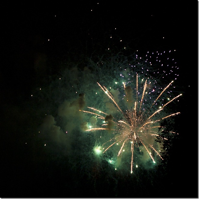
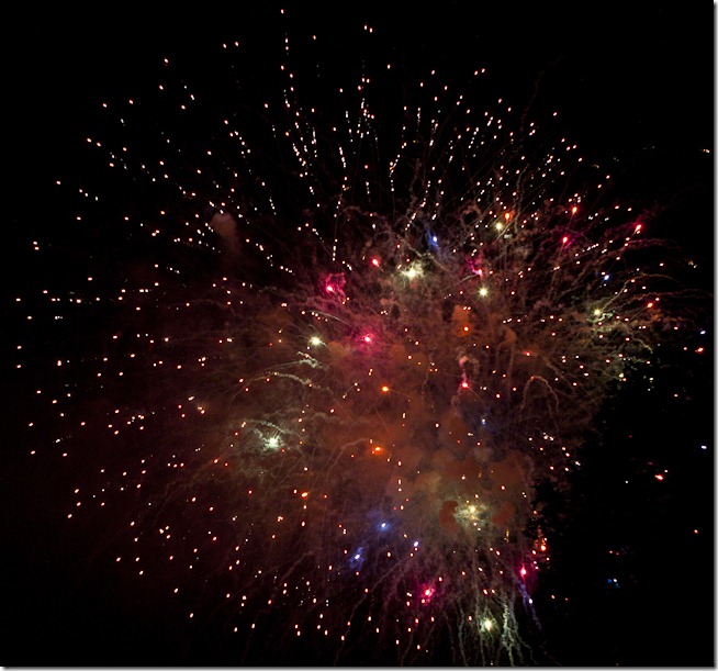
Trying to avoid the cliché fireworks photography, this year I decided to focus more on the light reflections in the smoke rather than the fireworks proper.  The result is the set of photographs I am sharing here.

Exploding Galaxy-3

I find these photographs more reminiscent of an exploding galaxy, or some of the photographs produced by the Hubble telescope.  I was fortunate to get these shots.  The wind was light, but blowing in the right direction – away from our location.  Any other direction, and I would have been unable to capture the lighting in the smoke.

Exploding Galaxy-4

So here is the takeaway:  If you are photographing something that is sure to be photographed by hundreds if not thousands of other people, take a moment to look at it differently.  Use your creativity to see something different.

Exploding Galaxy-5

Have fun, and go make some great photography.

Craig